St. Mary’s Center for Women & Children
St. Mary’s Center for Women & Children — Concept, logomark, and design system for a Boston nonprofit that houses and supports families experiencing homelessness.
Women and children are among the fastest-growing homeless populations in the country.
Shelters offer temporary housing without addressing the root causes of homelessness, such as unemployment, mental health conditions, and domestic violence. St. Mary's Center for Women & Children is built for the longer problem. Families move through a step-down continuum measured in years, from shelter into transitional housing into permanent homes, with case management and clinical care following them the whole way, organized around four pillars: stable housing, life skills, behavioral health and family medicine, and education and employment.
St. Mary's Center for Women & Children launched a capital campaign to fund its multi-phase campus expansion and double the number of families served. Their Dorchester campus sits atop Jones Hill in the former St. Margaret's Hospital, a maternity hospital that served the neighborhood for over a century. The expansion would turn it into dignified living and service spaces.
I came in at concept and worked toward the capital campaign. The Center was breaking ground on its expansion, and the identity had to be in market before the first donor ask. I developed several territories for the rebrand. Life's Journey moved forward. The route to stability is rarely straightforward, and the identity takes its shape from the unpredictability families navigate. I drew the mark, developed the guidelines, and designed the campaign landing page and presentation templates so the Center could apply the identity on its own.
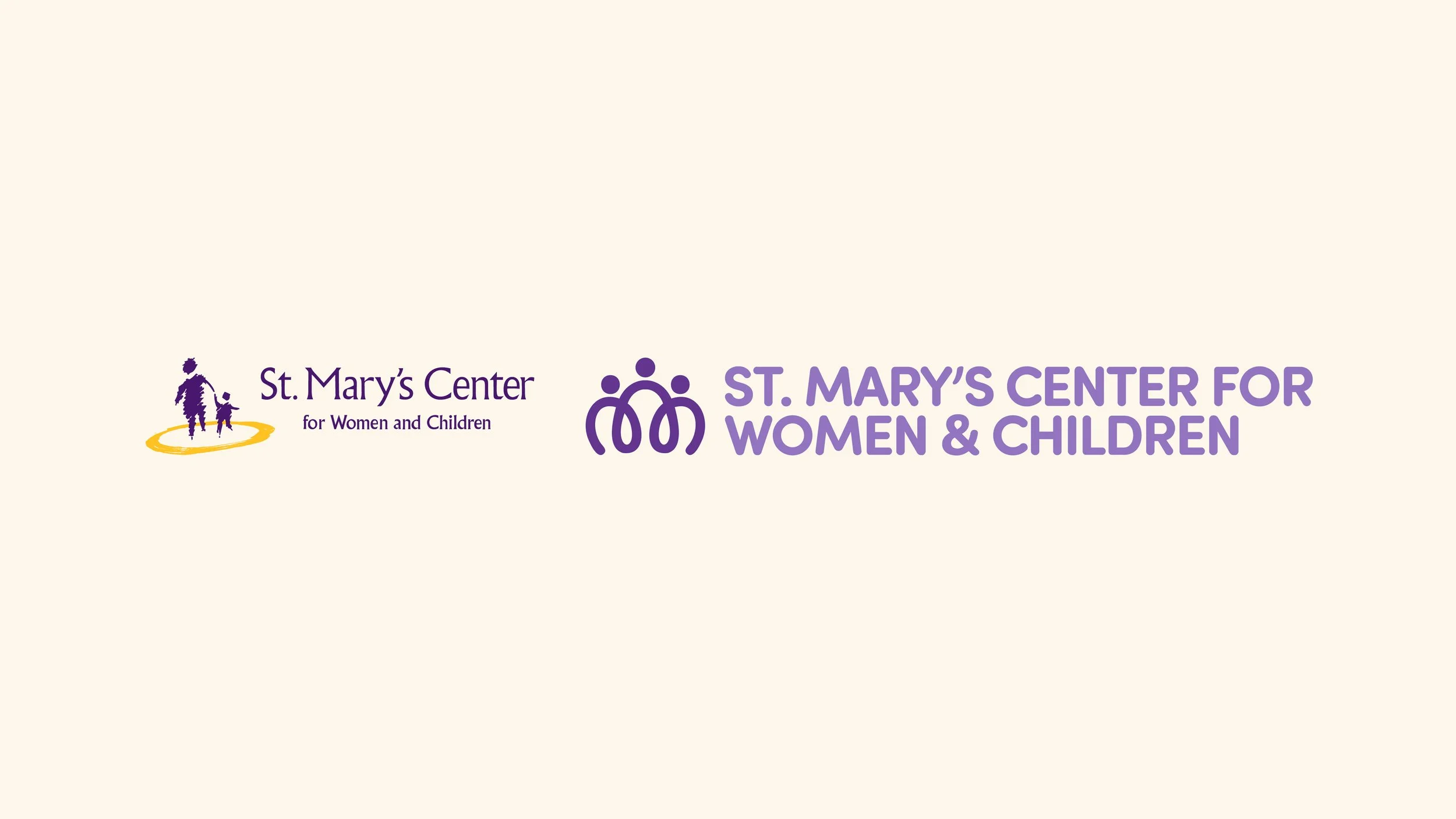
A before-and-after of the logo.
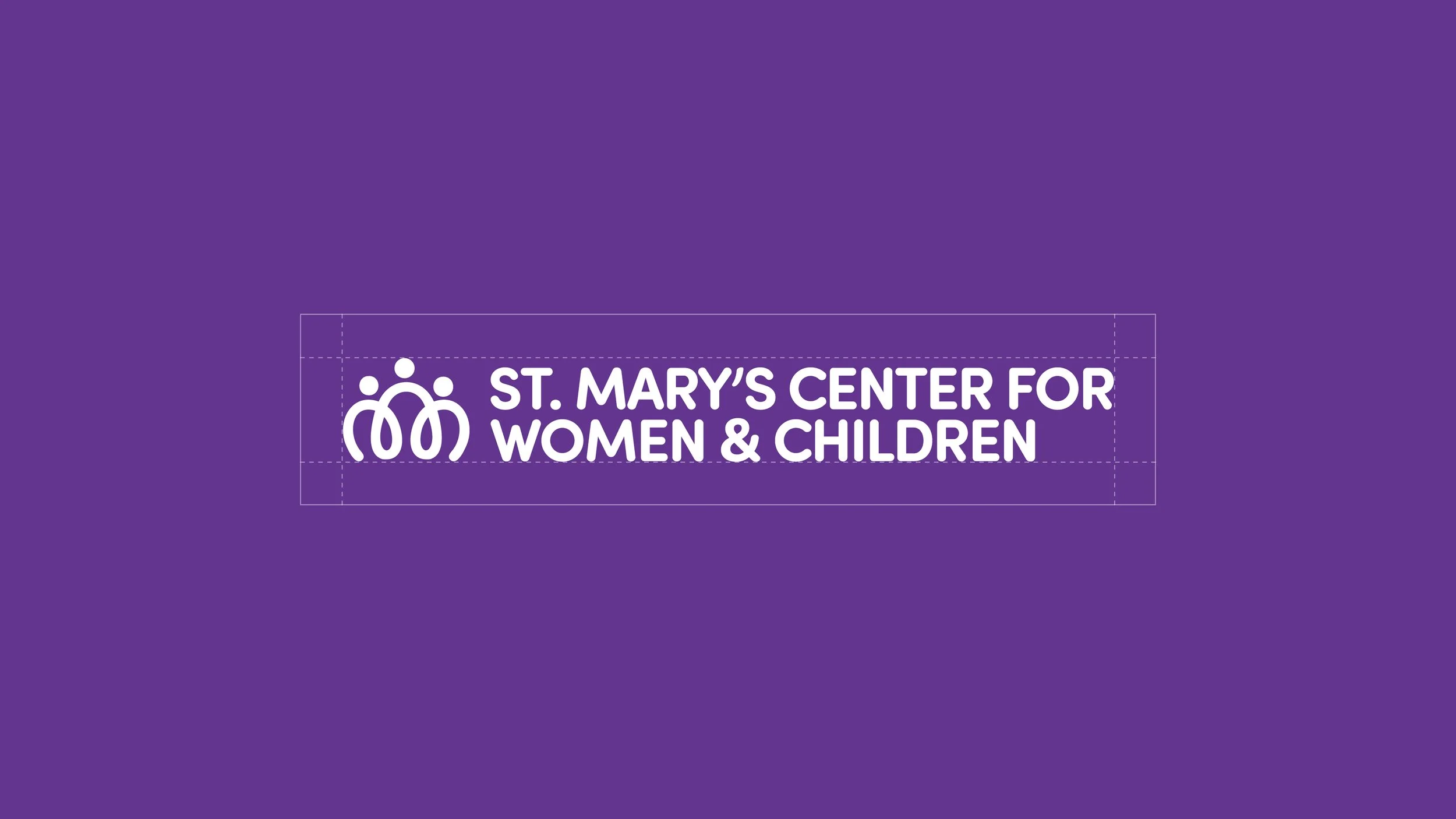
The mark is a continuous line that depicts a mother with two children at her sides. In the wordmark, "Women & Children" is the same size as "St. Mary's Center for," so the name gives the families equal weight with the organization, and the ampersand tightens the lockup while echoing the icon's curve.
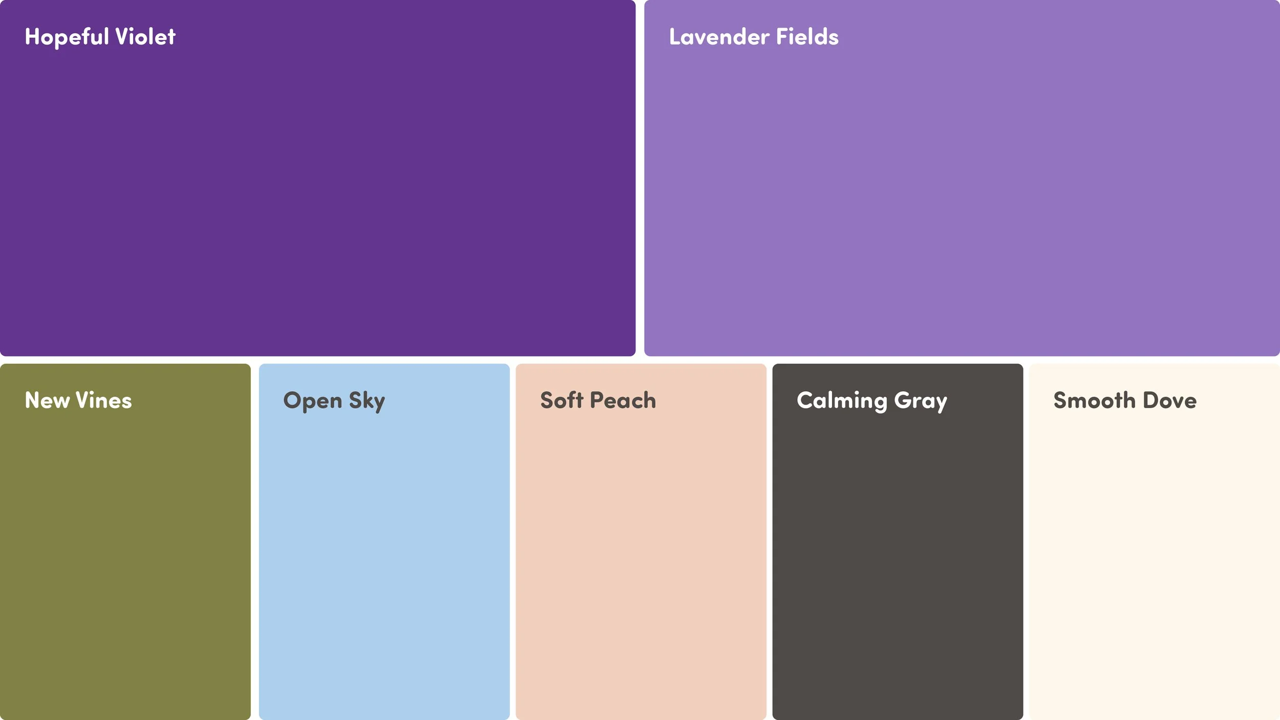
Inspired by trauma-informed color theory, the new color palette features a rich violet, soft lavender, olive green, light blue, and pastel peach. Neutral gray and cream ground the range and provide contrast.
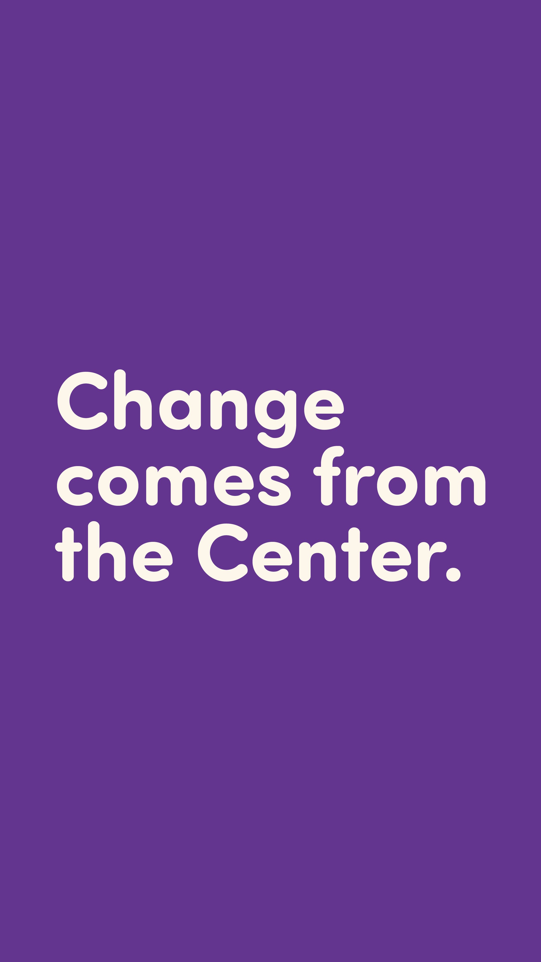
The Center's message had to reach families, staff, and donors at once. Sofia Pro Soft for headlines, with rounded terminals that carry short statements, and Sofia Pro for body copy, where the unsoftened forms hold up at small sizes.
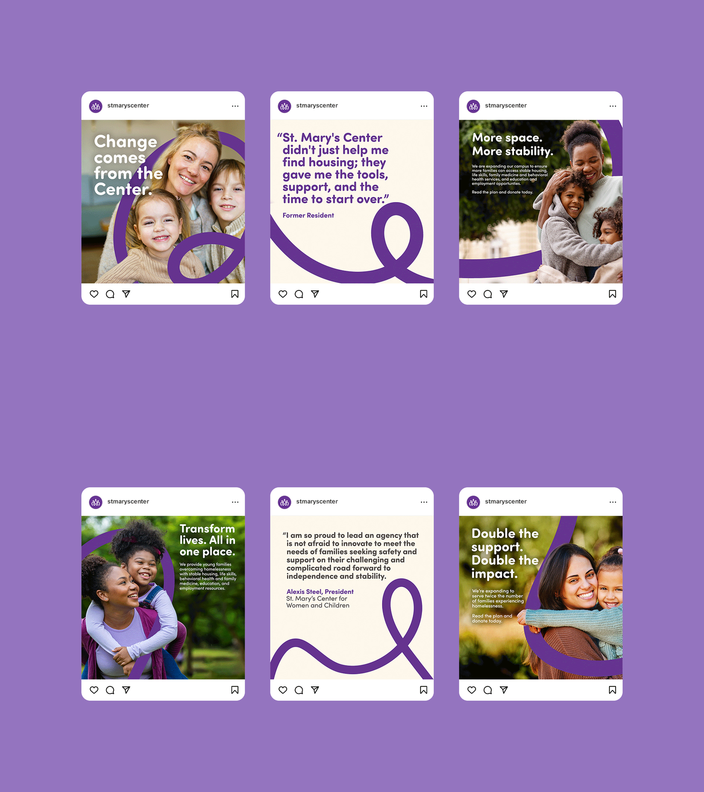
The curved line lifted from the mark recurs across the system, running behind photography, leading the eye through a social post, and carrying type along its path.